0%
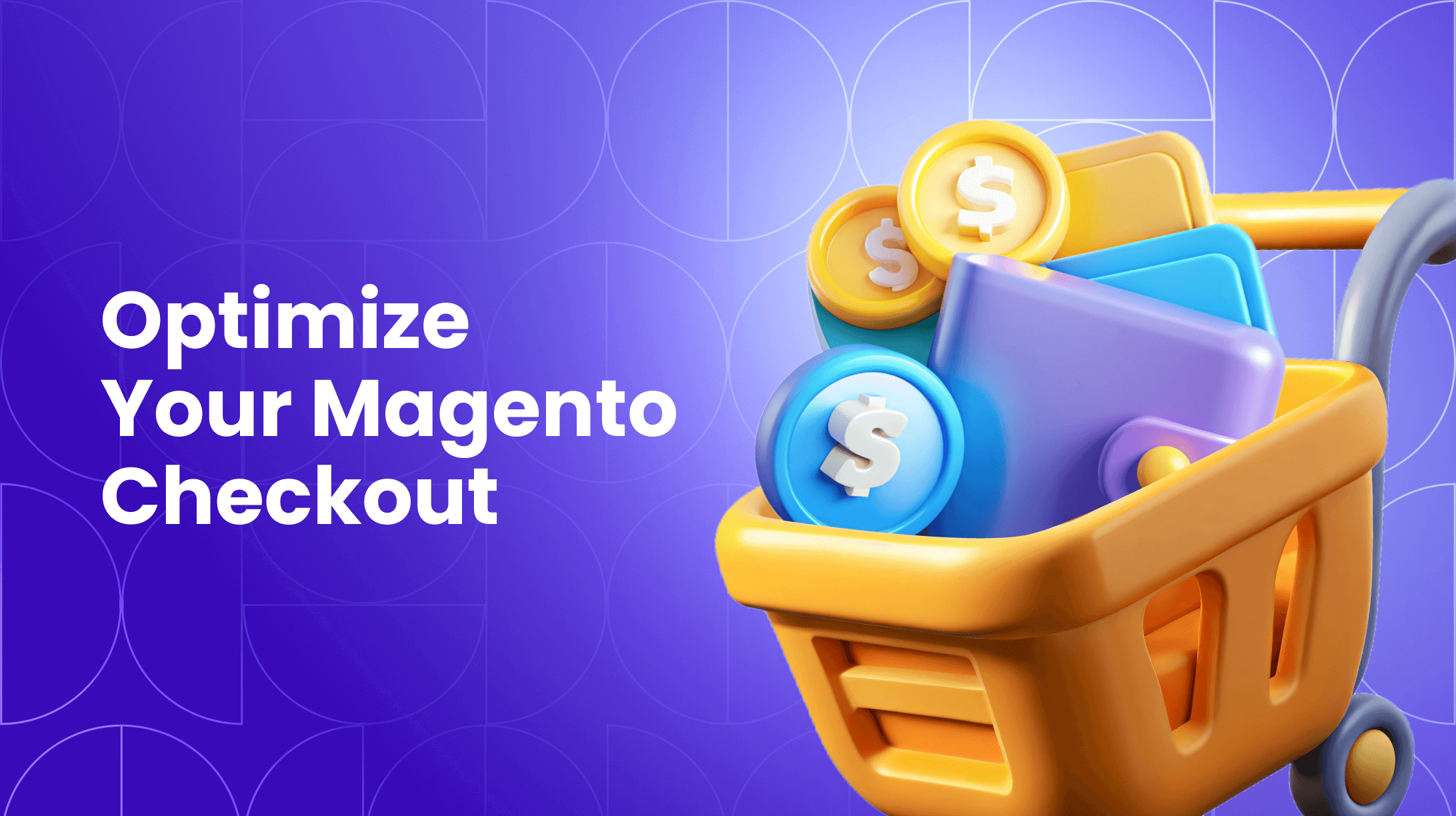
Nearly 70% of online shoppers abandon their carts while checking out. If you run an e-commerce shop, your e-commerce checkout page poses one of your company's most critical areas of risk. A poor checkout page repels customers, increasing cart abandonment. A checkout built with user experience in mind can mean the difference between a sale and a lost customer.
This guide will walk you through the most important steps of e-commerce checkout optimization to help you reduce friction and increase sales.
Why Should You Optimize Your E-commerce Checkout?
While at checkout, your customer is in the midst of a hard decision--parting with their money. If anything interrupts their path to clicking submit in their shopping cart, they might lose the urge to buy your product. It doesn't have to be an error. Confusing layouts, slow websites, or slight inconveniences will all drive away customers.
A well-designed checkout process instead boosts your conversion rates. Clearly laying out information builds customer trust. When checking out is easy, more customers follow through with their purchase. Focus on five key areas of your checkout process, and your conversion rates will improve dramatically.

Top 15 E-commerce Checkout Optimization Strategies
These e-commerce checkout optimization best practices are proven to transform your checkout from a point of abandonment into a seamless path to purchase.
1. Simplify the Checkout Process
Imagine you're grocery shopping. You get to checkout, and the clerk hands you a long form to fill out before paying. If you're honest with yourself, you might leave over this interruption to your checkout flow. You'd at least hesitate to shop there again over the inconvenience.
The same applies to customers shopping online. Simplify, simplify, simplify. Every step the customer has to take is another irritation point. There are several ways to accomplish this purpose.
Reduce the Number of Fields
Only ask for the most essential information. Do you really need your customer's birthday or gender? If most of your customers are from a particular country, can you get away with asking just their shipping address and avoid asking their country?
Use a Single-Page Checkout
Each time a customer has to click next, you're forcing them into a decision. Their subconscious asks them, "Do you really need this item, or should you stop buying it?"
Having a multi-page checkout also introduces the risk of glitches. What happens if the page crashes while the customer is hitting the next page? The customer might give up and not come back.
Allow a Guest Checkout Option
Many customers don't want to create an account to use your site. Allowing customers to check out as guests offers a quick and easy path to purchase. You can always ask them to create an account after making a purchase.
Remove All Distractions
The checkout is not a place for ads. Remove navigation bars, pop-ups, and other distractions. You want the only decision for the customer to be moving forward with their purchase.
2. Offer Multiple Payment Methods
Providing multiple payment options opens your doors to more potential customers. The most traditional forms of online payment include using a credit card or debit card, but there are many more options these days. Consider customers to use their preferred payment method:
- Digital wallets like Apple Pay, Google Pay, and Paypal.
- Buy now, pay later options with services like Klarna, Afterpay, or Affirm.
- Bank transfers
- Cryptocurrency
The more payment options, the better. Make it as easy as possible for customers to give you their money.
3. Optimize Your Checkout for Mobile Devices
Many sites focus on mobile optimization for the front end. The homepage, product pages, and blog posts all render beautifully on mobile.
But have you reviewed your checkout page on a mobile device? It can be easy to miss this critical page while performing a technical review.
Keep navigation simple and straightforward. Make sure all forms and buttons are easily tappable. Do what you can on the technical side to make sure the page loads fast.
A "responsive" design also requires:
-
Thumb-friendly tap targets
-
Large, legible fonts without zoom
-
Mobile-native input fields (e.g., number pads for credit card entries)
-
A seamless, vertical-scrolling journey
4. Provide Transparent Details
If customers sense any misinformation or deceit, even if unintentional, they will likely abandon their cart. Two key areas are cost and shipping.
Be Clear about Costs
Introduce any cost-adding elements like shipping fees or taxes as early as possible. You don't want to wait until the last page to surprise customers with this information. If a customer has a budget in mind, suddenly realizing the product is outside their budget will cause angst and hurt feelings. Even if customers can afford it, they might turn their back on your company out of principle.
Be Upfront about Shipping
The other surprise that can turn customers away is shipping speed. Many customers expect speedy shipping because of Amazon. Offer a range of shipping options, and be clear about the expected timelines for each.
It's not just about cost and speed. Several other shipping details include:
- International shipping. Be clear on whether or not you ship internationally and if there are any changes to shipping because of it.
- Free shipping thresholds. If you offer free shipping, having a reminder when customers are close can build trust and increase cart totals.
- Next steps. Let customers know they'll get a tracking number via email after purchase.
5. Implement Trust Signals and Security Features
People who shop online may feel apprehensive about purchasing from you if you are not well known. Do whatever you can to tell the customer you are a reliable, trustworthy business. Several methods of trust signals include:
- Display security badges – Incorporate badges from reputable organizations like Norton, McAfee, or TRUSTe.
- Use HTTPS – Using HTTPS tells a customer your site is secure and encrypts sensitive data.
- Transparent privacy policy – Make your privacy policy easy to find and easy to understand.
- Testimonials and reviews – Ask your current customers for reviews on platforms like Google or Yelp, and incorporate the best ones throughout your site.
- Live chat – Allowing customers to contact your company in real time lets them know an actual human is available to help
By incorporating these trust and security features, you reassure customers who may be apprehensive about purchasing from you for the first time.
6. Prioritize Guest Checkout
Treat guest checkout not as a feature, but as the default path to purchase. The moment you force registration, you are prioritizing your data collection over the customer's immediate goal. This is a losing battle.
Your action plan:
-
Ditch the forced registration form. This is the single most important action.
-
Make "Continue as Guest" the primary button. Visually, it should be the most obvious choice on the page.
-
Never hide the guest option. Don't bury it in small text or make users search for it.
-
Shift the account pitch to the confirmation screen. After the order is complete, present a one-field account creation: "Create a password to save your info and track your order." The email is pre-filled, reducing the effort to a single click.
-
Highlight the post-purchase value. Instead of "Create an Account," use benefit-driven copy like: "Turn this purchase into your personal account? Enjoy faster checkout, easy returns, and order tracking."
This approach respects the user's intent, secures the sale, and builds loyalty from a position of delivered value, not demanded commitment.
7. Guide the Way with a Progress Bar
A checkout process without a progress indicator feels like a journey with no end in sight, significantly increasing user anxiety and the likelihood of early abandonment. This simple visual tool is a fundamental element of a trustworthy user experience.
A progress bar directly answers three critical customer questions:
-
Where am I? (Current Step)
-
What's next? (Upcoming Steps)
-
How much longer? (Total Length)
Implementation best practices:
-
Use Descriptive Labels: Instead of "Step 1," use "Shipping," "Payment," "Review." Clarity is key.
-
Keep it Simple: A horizontal bar with 3-4 steps is ideal. Overcomplicating it defeats the purpose.
-
Ensure Visual Clarity: The completed steps should be distinctly different from the upcoming ones. Use color and weight effectively.
-
Make it Clickable (Optional): In a multi-page checkout, allowing users to click on previous steps to go back and edit information can enhance the sense of control and reduce frustration.
-
8. Streamline Form Fields to Minimize Friction
Every form field is a point of potential abandonment. A high-converting checkout form is the result of ruthless optimization, designed to get the necessary information with the least possible effort from the user.
Follow this four-part framework to streamline your forms:
-
ELIMINATE every non-essential field. Challenge the need for every single piece of data. Do you really need a title, a phone number, or a company name for a simple shipment? Less is more.
-
ACCELERATE completion with smart technology.
-
Implement auto-fill and browser autocomplete.
-
Use an address lookup tool that populates city, state, and zip code from a street address.
-
Set smart defaults (e.g., the most common country or shipping method) where appropriate.
-
-
CLARIFY what’s required with intuitive design.
-
Use clear, descriptive labels, not placeholder text that disappears.
-
Adopt field-specific formatting, such as displaying a credit card number in groups of four digits or providing a separate, clearly-sized box for the CVV.
-
-
VALIDATE input in real-time to build confidence.
-
Implement inline validation that confirms the data is correct as the user types (e.g., showing a green checkmark when a valid email format is entered).
-
This provides immediate, positive feedback and prevents the frustration of error messages only after submitting the entire form.
-
9. Design an Unmissable Call-to-Action
Your "Place Order" button is the climax of the entire shopping experience. This is not the place for subtlety or ambiguity. Its sole purpose is to be clicked, finalizing the transaction with confidence.
Build your CTA around three non-negotiable principles:
-
Command Attention Visually: The button must be the most prominent element on the final checkout screen. Use a bold, contrasting color that stands out from the rest of the page's palette. Ensure it has ample size and padding, making it an easy and compelling target to click or tap.
-
Use Action-Oriented Language: The text must be 100% clear and benefit-driven.
-
Do: "Place Order," "Complete My Purchase," "Pay Securely."
-
Avoid: "Submit," "Proceed," or "Next." These are vague and can create hesitation.
-
-
Eliminate All Ambiguity: The user must have zero doubt that clicking this button is the final, committing step. Remove any other competing buttons or links nearby. The page should funnel all focus and intent toward this single action, making the path to purchase perfectly clear.
10. Apply Strategic Microcopy
Use small, targeted phrases to eliminate final-minute doubts. This isn't just text - it's your silent salesperson addressing concerns before they become abandonments.
Place these trust signals where hesitation occurs:
-
At shipping selection: "Free shipping unlocks on next page"
-
Near payment fields: "All data is encrypted and secure"
-
By the final CTA: "30-day hassle-free returns"
Each line should target a specific anxiety. For example, "You're $12 away from free shipping" in the cart motivates higher order values, while "We'll email you a tracking number immediately" after purchase reduces post-purchase anxiety.
The most effective microcopy feels like a natural conversation - it anticipates questions and provides answers before users have to ask.
12. Create a Graceful Exit: 'Save for Later'
Not every checkout visitor is ready to buy. Some are researching, others are hesitant. A "Save for Later" or "Email My Cart" function provides a graceful exit that doesn't mean a lost sale. It captures their interest and opens the door for a remarketing sequence, turning abandonment into an opportunity.
13. Deploy Exit-Intent Offers
Capture abandoning visitors with a final, compelling offer. When user behavior signals an imminent exit—like moving the cursor toward the address bar or browser tabs—trigger a strategic pop-up to salvage the sale.
The most effective offers provide just enough incentive to overcome hesitation:
-
A time-sensitive discount (e.g., "10% off if you complete now")
-
Free shipping threshold relief
-
A bonus gift with purchase
This approach directly addresses the primary abandonment cause—cost concerns—while creating urgency. The psychology works because it feels like a exclusive, last-minute opportunity rather than a standard discount.
Timing is critical: deploy these offers only after users have engaged with the checkout process, ensuring you're targeting genuinely interested shoppers who simply need that final nudge to convert.
14. Launch Abandoned Cart Emails
Turn browser abandonment into recovered sales with a strategic email sequence. This automated system re-engages shoppers who left items behind.
The 3-Email Recovery Sequence:
-
The Reminder (1-4 hours later)
Subject: "Forgot Something?"
Content: Show cart items with a clear "Complete Purchase" button. -
The Nudge (24 hours later)
Subject: "Still Holding These For You?"
Content: Add social proof or highlight key product benefits. -
The Closer (3 days later)
Subject: "Last Chance + Special Offer!"
Content: Include a time-sensitive discount or free shipping to create urgency.
This progression moves from simple reminder to compelling offer, systematically addressing hesitation while creating multiple conversion opportunities.
15. Offer Real-Time Support
Unanswered questions are conversion killers. Implementing a live chat option staffed during peak hours (or a sophisticated bot) provides immediate answers to final doubts about shipping, sizing, or returns. This direct human (or human-like) connection can be the final nudge a hesitant customer needs to convert.
Giving Your Customers the Best Online Shopping Experience
By simplifying your e-commerce checkout process, you provide a clear, smooth road for your customers. Offering multiple payment methods and designing your checkout with mobile in mind helps customers avoid any hiccups while purchasing.
Being upfront with cost, shipping information, and security instills trust while customers complete a purchase. By implementing these strategies, you are well on your way to mastering e-commerce checkout conversion rate optimization and recovering a significant amount of lost revenue.
We've covered the theory—now it's time to execute. Use our dedicated checkout optimization checklist to audit your site and start boosting conversions today.
FAQ
What is a checkout in e-commerce?
The checkout is the final step in the online shopping process where a customer finalizes their purchase. It's the digital equivalent of a physical store's cashier point. This multi-step process typically involves reviewing cart items, entering shipping details, selecting a payment method, and confirming the order. An optimized checkout is critical for converting cart visits into completed sales.
What is the difference between a checkout and a POS (Point of Sale)?
This is a key distinction between online and physical retail.
-
Checkout refers to the digital process on an e-commerce website or app. It is a multi-step flow that a customer manages themselves on their device.
-
POS (Point of Sale) refers to the physical location or system where a transaction is completed in a brick-and-mortar store. It involves a cashier, a terminal, and a physical exchange of goods for payment.
Think of it this way: checkout is what you experience on your phone; a POS is what you interact with at a store counter.
What is a good checkout conversion rate?
While it varies significantly by industry, device, and traffic source, a good benchmark for an optimized e-commerce site is a conversion rate of 20-30% at the checkout stage. This means that for every 100 people who reach your checkout, 20 to 30 complete their purchase.
However, the most important metric is your own baseline. Use this benchmark as a guide, but focus on improving your own rate through continuous testing and implementation of the best practices outlined in this article. Even a 1% improvement can lead to a substantial revenue increase.

Expert in creating engaging written content. Skilled at analyzing audience behaviors and refining strategies to align business goals with customer interests. Proven ability to craft content that connects deeply with audiences. Passionate about staying current with trends to boost engagement.
Expert in creating engaging written content. Skilled at analyzing audience behaviors and refining strategies to align business goals with customer interests. Proven ability to craft content that connects deeply with audiences. Passionate about staying current with trends to boost engagement.